DANEMOOR FARM FIREWOOD
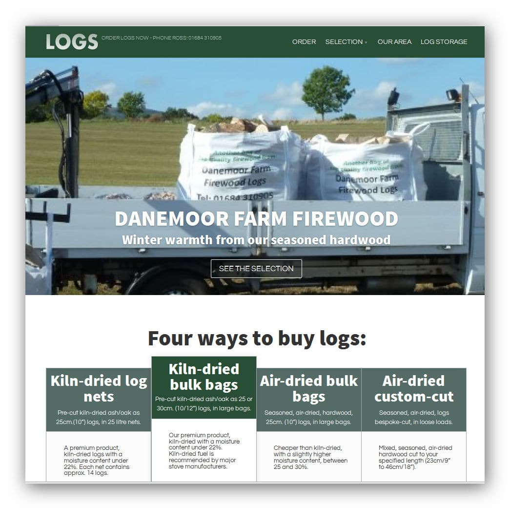
To me, this is a good example of modern, responsive one-page site. When the proposition is quite simple, one very long page is a good idea. Note the picture here shows four product options.
On a large screen the navigation bar stays ‘stuck’ to the top of the browser window, so it works like an old-style regular site. Except the nav. buttons (ORDER, SELECTION, AREA, STORAGE), instead of jumping to a new page, smooth-scroll to the relevant section.
On touch-screen devices, users seem to love scrolling, so works for them, which is good, as the elements stack up into a very, very long page. Note, on narrow screens, the navigation bar does not stick. If it did, on very small screens, there’d be little room for actual content.
SEE THIS SITE
CROQUE-EN-BOUCHE,
The Old Post Office Cottage,
Putley Green,
Ledbury HR8 2QN
Contact…
Robin and Marion Jones: mail@croque.co.uk
t: 01531 670809
CONTACT US?
Aware of EU cookie legislation, note we use cookies for social media, site analytics, etc. Nothing devious! But if you need more info, click the link above for the details.
© Croque-en Bouche Web Design.

